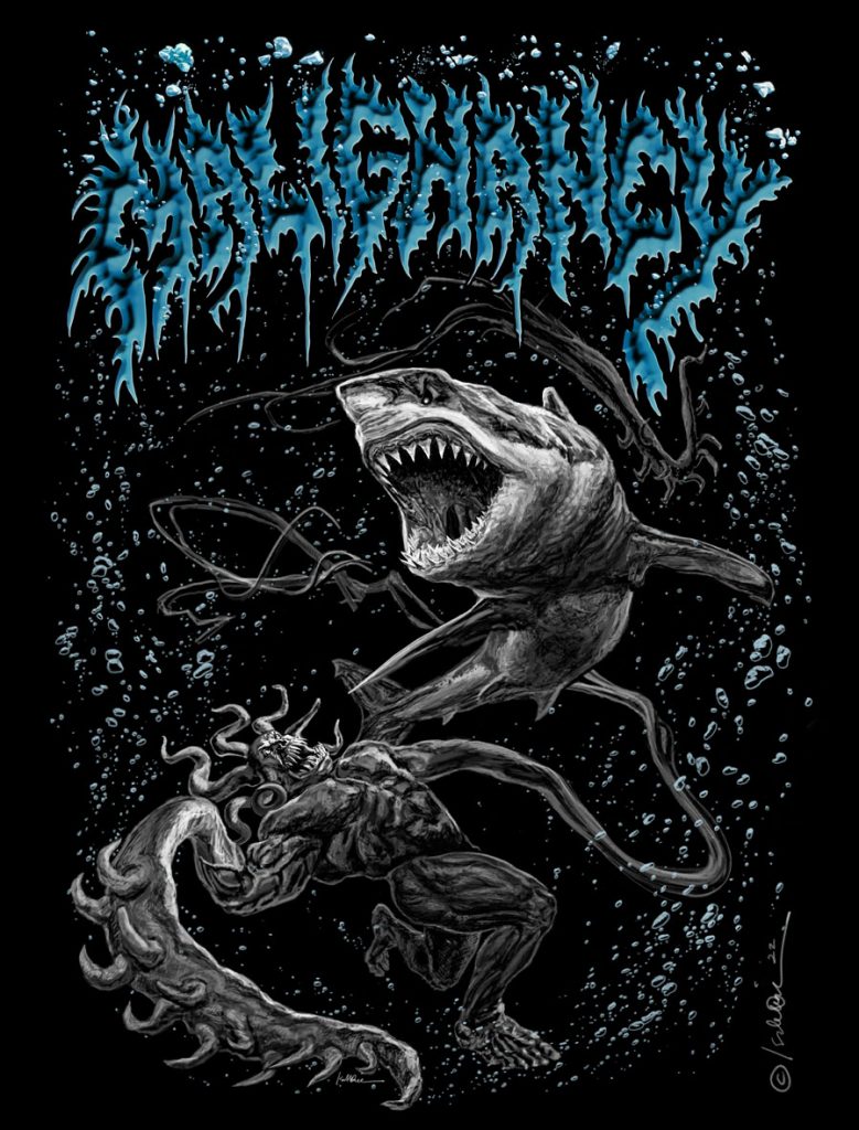
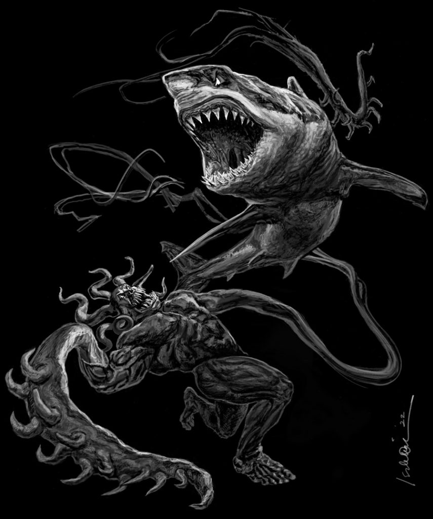
Artwork commissioned by Alexander Dela Cruz for the band Malignancy + Official logo from the Motivated by Hunger EP.
Shirt of black and white version is now available at Malignancy’s Bandcamp!
The two requested adjustments for the colored version were to make the shark’s eye more realistic vs. the original cartoon-like one, and the comeback of the underwater bubbles. Much as I like the severity of the plain black (at the bottom of this post), it’s a matter of preference at this point with each background being on opposite ends of a spectrum.
Now for some theoretical drawing stuff that was going through my head while making this.
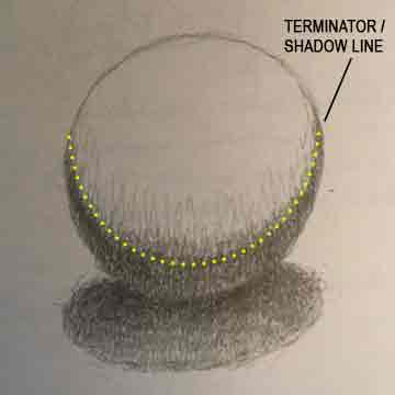
My least favorite terminator is the one found in drawing.
A conventional way of establishing form is by emphasizing the terminator. But, it is not the only way. Resorting to the terminator feels like going to church in exchange for salvation, or becoming vegan and expecting a clean bill of health. While simplistic concepts can help many people sleep better at night, they don’t necessarily guarantee success in life, or with a pencil.
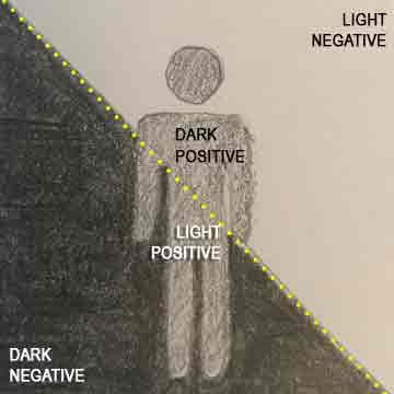
There are other drawing guidelines, e.g. ‘everything’s a sphere’ or putting most of the details in the lights (above the terminator). But what if I find everything that happens below the terminator far more interesting? The light is like Facebook, with its edited and curated versions of identities, not entirely false but not the whole picture either. When you stare long enough, you will realize that the party is in the shadows! They are like negatives (not opposites) of the spaces the light is occupying. This phenomenon helps me believe that other dimensions exist…Except people always think of dimensions in terms of just above or below. I believe that there is an axis too… E.g. we share a 45 degree axis with the dimension paired with ours.
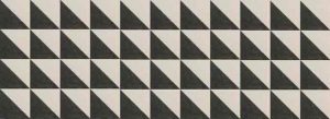
The drawing below is a fun thing to think about. It is a diagram how light and dark are not simply opposites.
In drawing form, I enjoy putting just as much emphasis on the shadows (maybe too much). Let’s just say I enjoy combining the interactions of the positives and negatives, and tend to subdivide shapes like a sphere into a cube, or better yet, a cube with each face divided into a dark and light side.
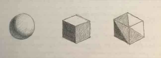
A sphere looks smooth because it has millions of planar facets, each with a dark and light side. If one imagines objects under this framework of facets, then it’s easier to put details in parts of a shape that are in the dark. In theory, the framework allows one to continue expanding or contracting a form infinitely, which pretty much affirms the “theory of relativity” for me.
If you’re still alive, send me a message with the subject ‘gin to my tonic’.
Sometimes light and shade become a blur and everything starts to look like the pic below. Usually it’s the signal to stand up and walk around. It also makes me suspect that people have been noticing this phenomenon for years, but haven’t been able to put a finger on it. They’ve created art movements such as Cubism instead.
While this work addresses volume and form with a certain ‘human common sense’, if one pays close attention, there are multiple distortions and even impossible angles. I think this piece made me accidentally stumble upon the fourth dimension, but alcohol consumption does that too.
Since I don’t want to leave with the terminator under a bad light (hahaha), I’ll quote my favorite one instead.
Hasta la vista, baby.
Click [HERE] to view the production notes.