My New Year’s Resolution for 2022 is to be at peace with this work…….. and drink less!
A finished artwork is just the tip of the iceberg. Ideally one would like to bask in its glory (if it turns out alright), but people rarely see or understand the great pains an “artist” goes through in hope to create something good.
Digital drawing’s advantage is the freedom to infinitely improve upon your work. The opportinity to infinitely revise is also its greatest pitfall. I hope this post sheds some light on being in that limbo for a very long time.
If we go by Socrates in the Phaedo, our consciousness (some call it soul) is complete prior to being born. I can’t help but agree, because I would look at things and see or feel that something is “off”… E.g. I can tell that someone has had work done on their face just by looking at a photo, not exactly cutting-edge stuff but it’s a strange skill. This “radar” is quite handy as a tool for aesthetic understanding, but when it comes to my own work, it inflicts torture. Since I didn’t have a deadline, the liberty of not having to find quick solutions for all the things that felt “off” was like falling into the abyss.
When it comes to drawing, I have quite thoroughly searched all the classical drawing books within my grasp to define what I’ve been looking for, and it seems no one has attempted to put these “qualities” into words. I used to assume that everyone decent in this profession secretly knew about it except me, but I am learning more and more that that it’s probably the other way around. In a positive sense, it’s like life. There’s no manual for doing things the right way, a lot of it is trusting your gut or moral compass — living the way that will let you sleep at night. A lot of it has to do with the degree of one’s desire for understanding. “Ignorance is bliss” was not coined overnight.
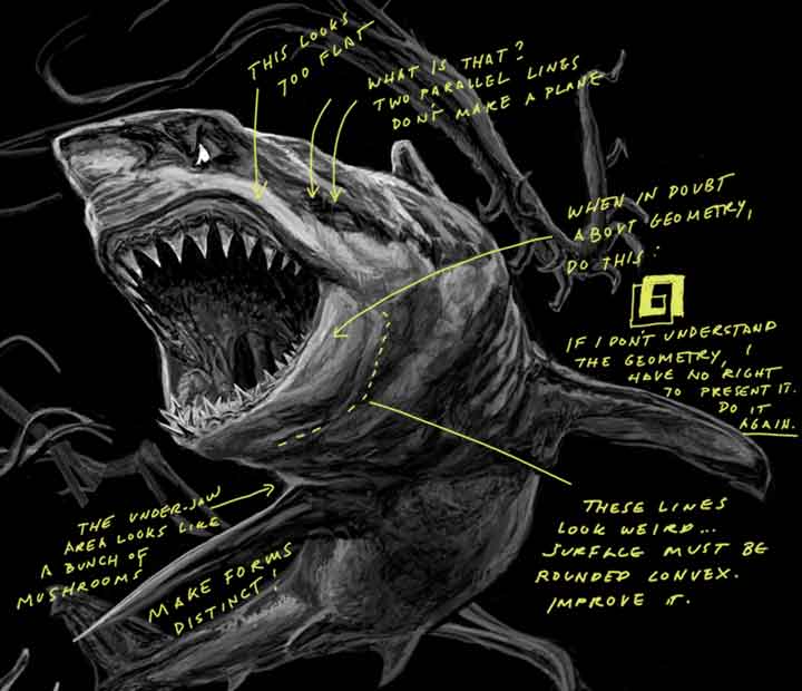
Now is also a good time to say I hate blending or smudging two colors/hues/shades together. While it has its uses, blending is what people generally do when they’re confused. Blending is like “blurring reality”, which is how many people choose to live their lives. Your drawing can be dirty as fuck, but if your highlights and shadows are in the right place, everything will make sense (just like facing the ugly truth). In searching for the missing piece to this artwork’s puzzle, I would dream of drawing that one final line, or triangle that would put this journey to an end. Maybe this whole diagonal light crap is a figment of my imagination, but if a shape, line, highlight, or shadow is not split at an angle, it feels wrong, and weird, and I’d have to start all over again.
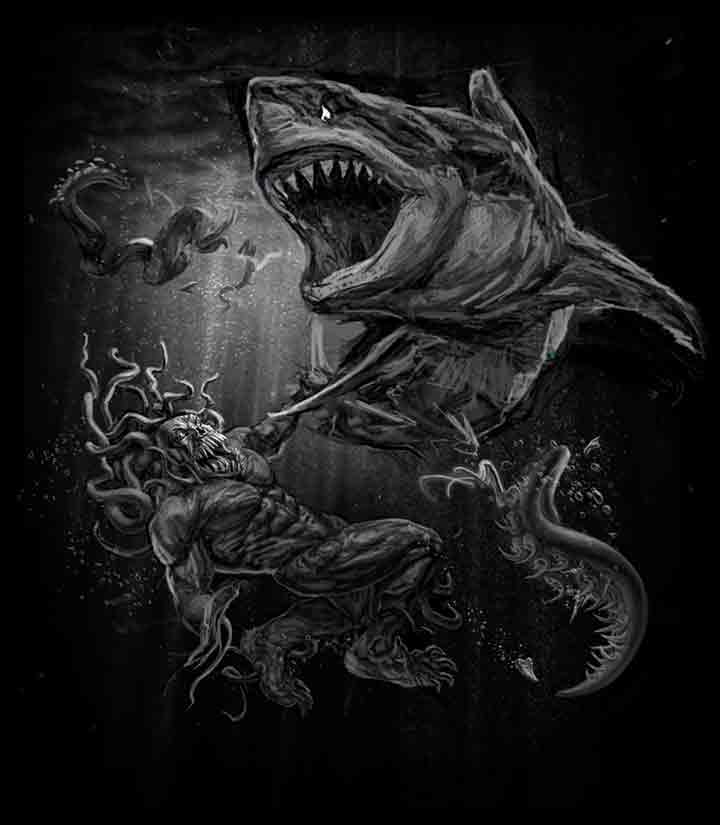
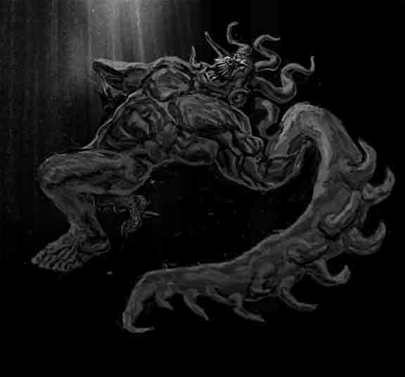
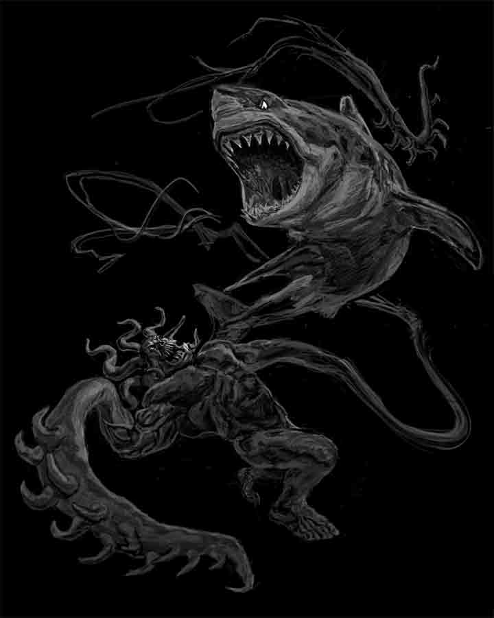
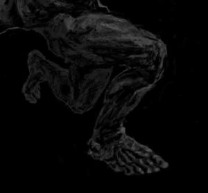
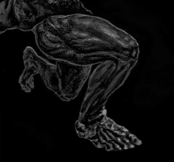
Did you know that there is a horizontal ligament just above the knee that holds the quadriceps together? If you look at anatomical diagrams, you won’t find it, but trust me, it’s there. It’s really funny that I’ve never studied so much anatomy just to create a creature that doesn’t exist (outside of death metal merchandise and promotional material). Picasso allegedly said that “in order to break the rules, you first have to master them so you can break them excellently.” It’s a nice way of re-wording the Renaissance principle of “Disegno”, but basically, I have never studied the human body or sharks so extensively to portray things that don’t exist, “realistically”. I think what is most important is in the end, this artwork made me find my own language, which lead to my own answers. I don’t think anyone will find magic in this life unless they go through such a process.
Hopefully documenting what I went through would shed some light on how being an “artist” is not easy, especially when you have to resolve things in your artwork while worrying about how to pay the bills. I don’t fart my way through inspiration. Most of the time it’s not even there. This kind of work is self-inflicted, but gratifying torture without a monthly paycheck. If you want to draw, this might help somewhat, but either way, anyone who reads through this might die a little bit.
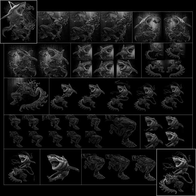
I.
8.21.2017 – The artwork was left in this stage prior to the very loooooong break. There was no deadline, I was feeling stuck, and life got in the way.
II.
8.3.2020 – Almost 3 years later, I had a little extra time on my hands and resolved to give this artwork the conclusion it deserved. The promo dude definitely needed work.
III.
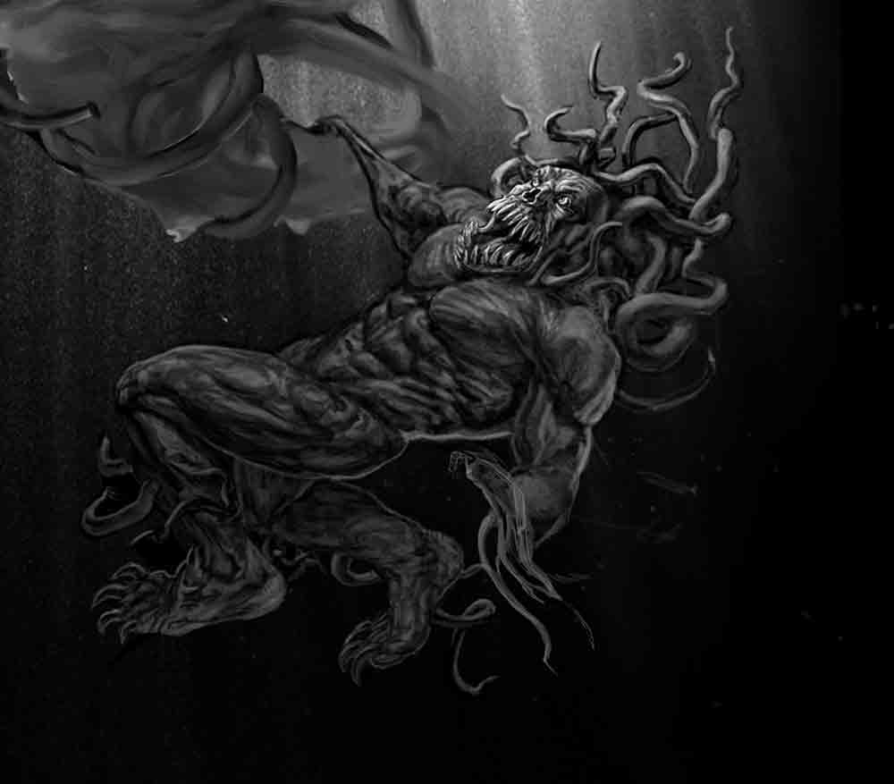
9.23.2020 – After trying many body types, skin tones and configurations, I was fairly satisfied with this version of a very ripped promo dude. He certainly liked going to the gym.
IV.
10.12.2020 – 11.11.2020 – Shark development – Shading on the top of the head, gills and fins change. I also thought that bubbles would give the composition a greater sense of movement. Bowel movement maybe. Nope.
V.
12.7.20 – I couldn’t pinpoint what was missing so I decided to flip the image. I was pleasantly surprised that the promo dude didn’t look distorted at all, which meant that my rendering and sense of proportion were decent! At this time I was still too engrossed in the details to notice that the shark’s head looked a bit compressed.
VI.
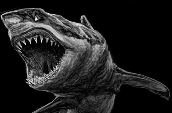
12.29.20 – I realized what was bothering me so much about the shark. Great whites are two toned after all, and in all the previous versions, I failed to show this.
12.31.20 -I was so obsessed that I worked through the New Year. If you look at the dorsal fin you’ll notice a moment of insanity.
VII.
1.27.21 – I have myopic tendencies of fussing overly on details such as the shark’s mouth to make it look ferocious + obsessing over the diagonal lines created by light and shade. I tend to forget the bigger picture, which in this case is the shark’s face. It was starting to look like a kite!
VIII.
4.21.21 – 5.29.21 Stuck again while trying to develop possibilities. At least I realized that the shark’s face looked weird!
I finally felt a breakthrough with look and expression, except this one looked like a cross between a great white and a Dachshund…A Dachshark!
In drawing one line can turn the ridiculous into something more tangible, and vise versa.
IX.
6.9.21 – What made the shark so tricky was how the light was hitting the darker top part of the shark, while the white belly was in shadow. I have so many renderings because presenting this accurately was so important.
6.29.21 – At around this point, I’ve started to make up my mind but again failed to realize that the shark was losing the expression I liked in the rightmost pic of VIII. Here it’s starting to go goth on me.
X.
6.30.21 – When I put the updated shark back in with the promo dude, It looked like it was drawn by someone else. Not seeing the promo dude for a while made me realize how stiff he looked –like he got a cramp while swimming. Something also had to be done about the ‘headtacle’ situation because it looked like he had male pattern baldness. The missing arm suddenly felt quite boring….All of it felt boring. The shark also looked bizarre because I was trying to reconcile two angles simultaneously…. With the mouth opened that wide, the eye could not possibly be that near the nostril, but it was all for the sake of expression.
XI.
6.30.21 – Back to the arm issue. This giant spikey tentacle arm worked for me!
XII.
7.3.21 – 7.20.21 – I strongly believe that one cannot be afraid of letting things get LOL-fucking ugly, or you will be stuck forever. On the bright side, at least things continued to look ok even when the image was horizontally flipped multiple times. It was an indication that things were headed in the right direction even if the actual direction was vague.
XIII.
7.21.21 – I decided on focus on something I knew how to fix instead –the headtacles.
8.9.21 – I realized that all this struggling was partially because I wanted to add every single ding dong detail in. Finally decided to simplify the forms.
XIV.
8.13.21 – 8.16.21 The way the background detracted from the main subject matter started to feel like a burden. Getting rid of it completely was both a relief and a revelation. It also created other problems, e.g When you put a black outline around something, you get a positive shape…when you draw a white outline around something you get a STICKER! I wasn’t even close to figuring out what I wanted the characters to look like.
If you’re still alive, send me a message with the subject ‘pelotudo is menudo’.
XV.
8.18.21 – 8.23.21 – Somewhat satisfied with the direction the body was taking, I decided to resolve the issue with the left arm. Originally it was wrapped around the shark while the right was ripped off. How I wish drawing always went as smoothly as the solution that came to mind. I also started mucking around with the shark yet again, and find the spotted version on the right quite amusing!
XVI.
9.2.21 – Finally a version that I was beginning to like. Sure the Promo Dude was slightly dachshund-ish with its long body and mini legs, but the torso looked good. I was starting to believe my problems were almost over. This was only the beginning.
XVII.
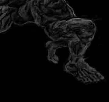
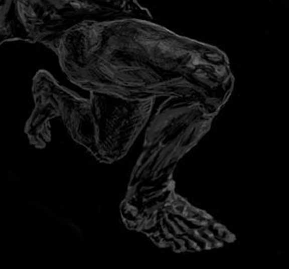
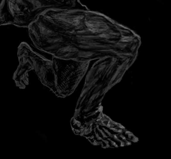
9.13.21-9.30.21 – As mentioned earlier, the promo dude also had a dachshund phase with mini legs. Many men who lift weights skip leg day, so it’s not entirely unrealistic, but no. How much of the vastus lateralis (part of the quadriceps) should be seen? Why not make the entire top of the leg one smooth curve? Boring…. Plus, I had to find a creative solution to prevent the lower leg from completely disappearing. The last pic in this group is pretty cool in terms of “theoretical lighting” below the knee, but still did not feel right. Finally, I had to make the top of the left leg look less like an oblique.
XVIII.
10.12.21 – ‘Empanada thigh’
10.13.21 – I actually like this version but it didn’t match the body. I’ve always suspected that Cubism was borne out of people trying to understand the phenomenon of light and getting frustrated. If you look at the main post, there are a few diagrams about the significance of the diagonal line + how light goes alternatingly over and under the facets of an object.
10.19.21 – I tried to see what it would look like if I made ‘everything a sphere’. Nope.
10.20.21 – This one is called the Cubist leg, not after the movement, but it resembles bricks one on top of another. It was an attempt to create a ‘macho’ knee. But after messing with the knee so many times including a phase where it looked like he desperately needed to pee, at least the knee cap was back to facing forward.
10.24.21 – Another version with a sexier knee this time. Nope. It also made his skin look two-toned, like the opposte of the shark.
10.26.21 – Putting the knee back where it made the most sense. This whole leg phase was brought about by drawing the leg in low light with anatomical confusion. How much of the outer hamstring should be seen from this semi top view angle? How do I show the division of the gluteus maximus without making the leg look like it has an armrest?
XIX.
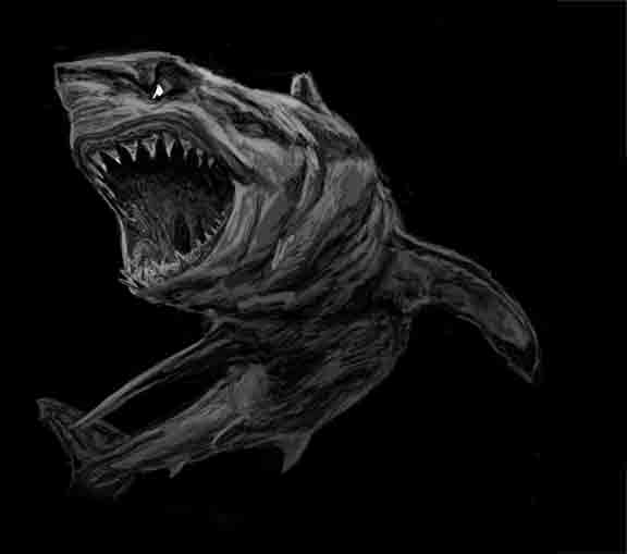
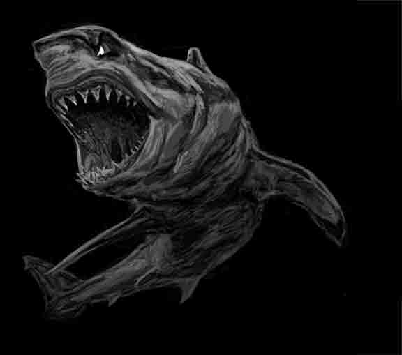
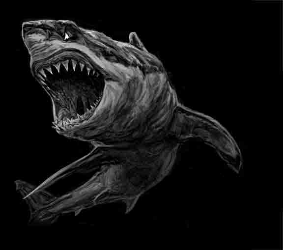
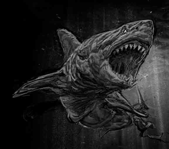
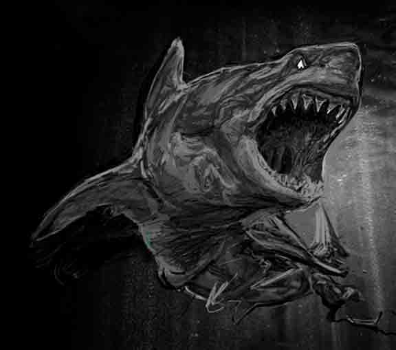
10. 20. 21 – I finally realized that the shark’s face was such a pain in the ass because sharks mouths simply do not open that wide. My version had a view from under and over simultaneously so that people could enjoy the teeth. The tip of the nose was pointed upwards, but the eyes had to be lower in order for them to look at the promo dude. All along i also thought that the shark’s lower jaw was like a bowl, but it’s more like a ramp opening out of a UFO. Despite so many pictures on the internet, it literally took me up ’til the very last minute to figure this out.
10. 24. 21 – This is one of my favorite versions of the shark. The chest area is detailed but with ease, you can see the divisions of the sections, and the head looks pretty cool and fierce….Except with its downturned nose, it kinda looked like a sock puppet
10.26.21 – Back to the drawing board. It should scream shark upon the first glance.
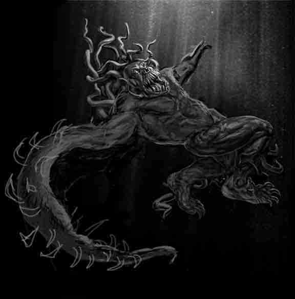
XX. And the Nightmare Begins All Over Again…
Post-Prod I: And Here is How I Tear My Work Apart.
Nothing is good enough.
Since the artwork wasn’t needed yet, I decided to do something about it.
Post-Prod II.
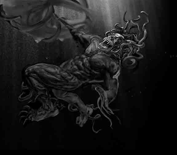
Often this gnarly process made me wonder why I didn’t become a vet, a doctor, or get into a biology related career as originally planned. My source of income would have been reliable to say the least. The bodies of organisms have intrinsic survival procedures that make the topic of health easier to understand. Injury aside, excess is the most common cause for health’s decline. On the other hand, excess can be quite a good thing in art.
The struggle with art, is that you are inventing a cause that doesn’t exist, or better yet a universe. In a way it mimics life in that there is no official manual to do things the right way. However one cannot make a universe without understanding natural processes that already exist. It’s the Renaissance principle of ‘Disegno’ all over again, where you need to truly understand the nature of your subject (and the subject of your nature hahaha), before you start breaking the rules.
Kingdom. Phylum. Class. Family. Order. Genus. Species….. Class Mammalia is so much easier to understand because the joints and musculature between a human and a dog are not too different. It’s just a matter of orientation and proportion. A shark is more distant on the evolutionary ladder and I struggled with its anatomy. E.g. Why does it need so many gill slits as opposed to just one like other fish? Or how I couldn’t just go looking for the counterpart of its gluteus maximus. It did not help that the shark that expressed what I wanted was already distorted. Then after looking at hundreds of shark photos, I noticed this:
WTF is that anyway?
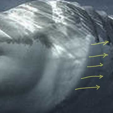
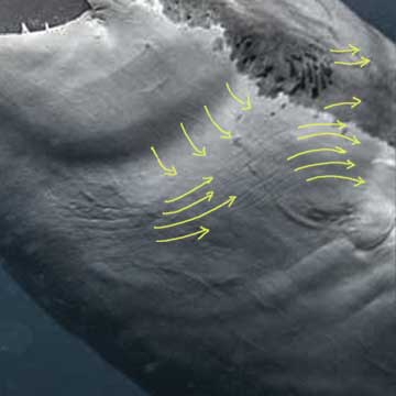
One of the things bugging me so much is how I know sharks aren’t exactly smooth, just like planets only look smooth when you’re far away from them. The best description would be that they are like parachutes with an intricate mesh or lattice of connective tissue? cartilage? I’m not even sure. Their heads especially have horizontal filaments vs. perpendicular vertical filaments that allow their gills to expand and contract. I think this mesh = vestigial scales, since sharks evolved after bony fish. Since my goal was to draw the great white of all great whites (hopefully), I might as well bring people’s attention to qualities that are often overlooked. I also like the idea of how I used existing phenomenon to give something a mythological status.
This is why digital artworks + me are a match made in hell. I cannot stop. But, after a few more days of possessed drawing, I finally was able to capture that moire effect on the shark. More importantly, I was able to fully understand the architecture of its lower jaw — A small victory. For something supernatural and ancient, a very smooth shark also looked odd, like it bought a ton of Korean skin products, or used one of those face smooth apps.
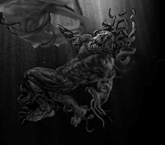
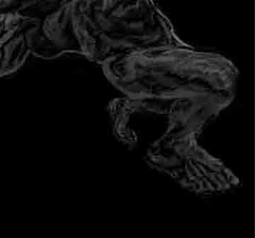
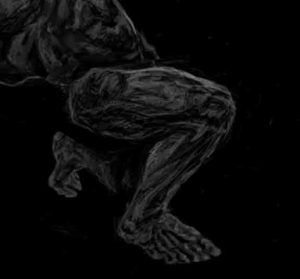
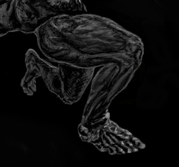
Post-Prod III. How The Leg Came Back to Haunt Me.
This is a story of how the quadriceps came to be my favorite muscle. If one would have asked me to describe the shape of the quadriceps prior to this chapter, I would have said something like…. Imagine there were two Pyramids of the Sun in Teotihuacan, Mexico. Now glue their bases together and twist the tops in opposite directions. The rotation of each of the subsequent tiers would be around 30 degrees apart. Since each tier/layer is a square, none of the corners will be aligned with each other. See? Confusing. But I still wasn’t satisfied with my very conceptual interpretation that lacked anatomical knowledge. I wanted something life-like to affirm that in order to break the rules, one has to master them. In order to create an amazing monster, I had to fully understand human anatomy first. Besides, my Promo-Dude looked like he skipped leg days at the gym. Last not but least, the true essence of understanding something is being able to explain things, simply.
There is an insane amount of versions of this leg, pre, and post-prod. I’m going to stick to the three most distinct ones.
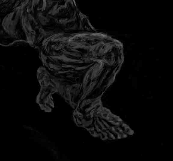
11.13.21 The Smooth Leg – If you’ve skimmed through the main post behind this artwork, you will come across my notion about diagonal lines and drawing. Even lines our outlines need to be bisected diagonally at every turn to make a drawing life-like. Sometimes something as little as a dot can suggest that there is a change of plane. It explains why I put ‘corners’ on the top outline of the V1 leg. Since I suddenly had the urge for more realism, the first thing i tried was to smooth everything out. He still skipped leg day, so nope.
12.6.21 The Cool Leg – I actually liked this one very much. I thought it was almost clever, and went well with how the way the leg twists is like an impossible object. But, the muscles at this angle did not show enough light.
12.21.21 The I don’t know anymore leg – I don’t know anymore. But right after this, I ended up with a leg that made me happy (it didn’t last long). I’ll call it ‘The Simple Leg’. Oh and the quadricep by the way is like a Parallelepiped (păr′ə-lĕl′ə-pī′pĭd, -pĭp′ĭd) — See? Simple! One word! Hahaha.
It’s just a leg. But, drawing it well is very tricky. Between the plane change from the side of the quadriceps to the top, trying to figure out whether the striations are from the muscle or the IT band, trying to figure out how much the tensor fascia latae flexes when the leg is bent, to how the crazy way the skin shines makes everything more confusing + wondering how shiny it’s supposed to be underwater. What I did learn is that I’m not the only one who’s not exactly sure what’s going on. Amusingly, even the best professionals out there have done some funky stuff when it comes to drawing the quads, or better yet adorn it with some sort of leather band to get it the hell over with. Why did it take me so long to finalize it? Because I wanted to capture the plane change from the side to the top of the leg in a clever manner, a la Burne Hogarth without making a Burne Hogarth.
Once I become a become a bajillionaire, one of my fantasies is to hire a professional bodybuilder to model for me. I’m still a bit confused about what the sartorius muscle does when the leg is bent and is at this angle. All the references I’ve looked at are wearing clothing so there’s some guesswork involved + diagonal theory never fails for times like these (See the main post about this artwork for that). Still, I think the most amusing thing that I’ve learned through ‘befriending the quadriceps’ is that the struggle is real.
Someone once asked my why my drawings are so “squiggly”. While in my head these squiggles/dirty triangles and dots represent plane changes or facets, they can probably look like ‘noise’ to other people. Maybe this is psychosis, but people also love life when it’s blurred. It’s a “draw”.
Last but not least, Escher would probably laugh in his grave about the leg, but I’ll leave it to the viewer to figure out why.
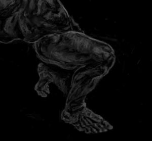
Epi’leg’ue
A few days after basking in a sense of ‘closure’, I took another peek and felt that there was something grossly wrong with the bloody leg again. AGAIN!!?!?!? WHYYYYYY?????? That was the issue with this work from the start! Draw like crazy until you feel good, sleep, wake up and wonder how the hell I was able to sleep knowing that what I drew the day before was ‘abominational’.
Even if I was in the middle of continuing a watercolor I left half-way, even if using real paint again felt absolutely glorious, I knew that if I didn’t get this right it would be something that would haunt me for the rest of my life. So in the span of 13 days, several more versions cropped up!
This is why I don’t like the concept of a ‘terminator’ in drawing. All areas in the light will have a lighter light and a darker light. Same goes for all shadows, and this all happens d-i-a-g-o-n-a-l-l-y. Then there are also highlights, where a photon bounces off an object at an angle that hits your eye, so highlights can happen in weird places — As if things couldn’t get confusing enough.
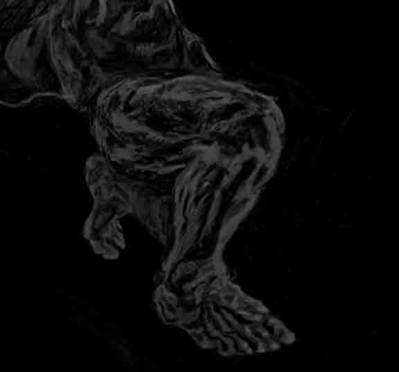
To the left is the leg I ended 2021 with. Pretty sure I’ve mentioned before that showing the plane change from side to top of the quadricep made it tricky. At that time I thought it was a clever solution to make the light from the adjacent planes come from opposite directions (dark to light on top, light to dark on the side). Besides, this happens often enough in nature…But visually, it’s not clear. It might be interpreted as another one of my ‘squiggly’ moments. It felt good for 24 hours, then nope
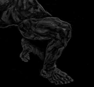
2022 v1 – I almost gave up and resigned myself to this very straightforward version. I still could not pinpoint why something felt wrong in the ‘edge lighting’ on the top of the leg.
2022 v2 – Much as I hate doing so, I tried copying the edge lighting on my reference dot per dot. Now the upper quad looked like all the other works of those people who copy things and call them art. There’s a certain order to it, but no ‘aspective’ sense. It looked stiff, boring, dead. Not even close.
2022 v3 – This is a different interpretation on 2022v1, the version I deemed most succesful. I tried imagining what it would look like if the plane shift were much sharper. It felt good, clever even, it wasn’t copied…Then after a few days of not looking at it, It looked absolutely bizarre again. Perhaps something is just wrong with me.
2022 v4- There isn’t really anything wrong with this one, but removing the edge light made the leg kinda disappear when viewed from a distance. I also spent some time reviewing lots of other artworks and comics with ‘muscle men’ and realized how so many artists avoided this bloody edge light altogether because it’s so damn tricky. This was enough motivation to put it back in.
Einstein said that madness is repeating the same thing over and over while expecting a different result. If finally dawned on me that the entire edge light was off. No matter how many interpretations I made of it, it won’t ever match the unless I change my perspective completely. In the final version of the artwork, you’ll see how I solved this nightmare once and for all.
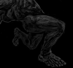
I don’t know why I had to go through this, but I did learn a few things:
1. Just when you think you’ve done everything you could and that there’s nothing left to offer, you will discover that there is always something more in you. But, you have to fight for it.
2. For the right reasons, I am probably the most persistent person in the world.
3. The very last bit of it confirms another theory I believe in…If you have two adjacent objects (not planes), they cannot be lit the same way. Some people say that in shading, ‘everything is a sphere’ and yet fail to mention that one cannot have two spheres with the exactly the same lighting overlapping each other. This is because doing so will break the diagonal lines light and shade naturally create, causing the drawing to not make sense. Heck I’m even struggling trying to make what I want to say make sense. In this case, if the promo dude’s upper body has an edge light that is thick in the North East, the lower half cannot have an edge light with the same thickness in the north east as well. The bottom line is, the final final final leg affirms all of this without being copied. I fell asleep, woke up the next day, looked at it and it felt right.
So much for finishing this in 2021.
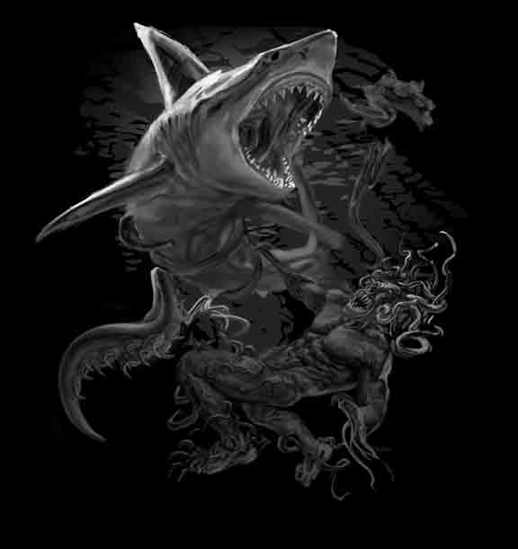
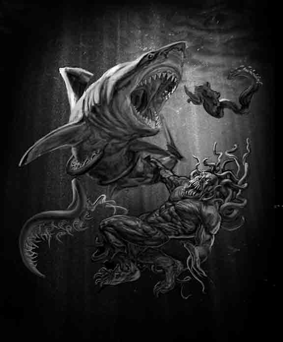
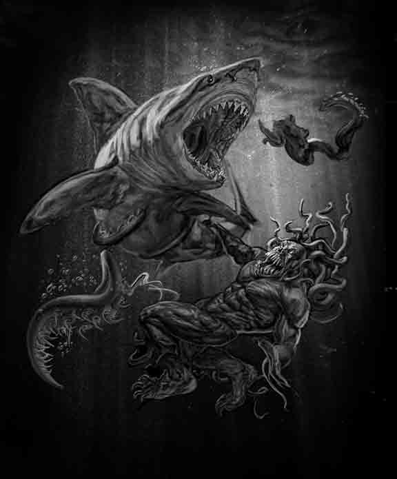
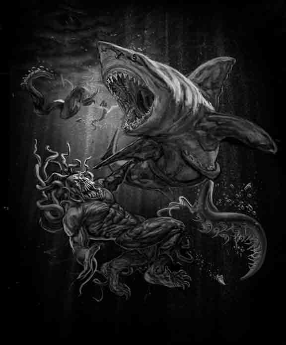
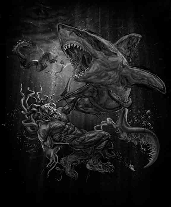
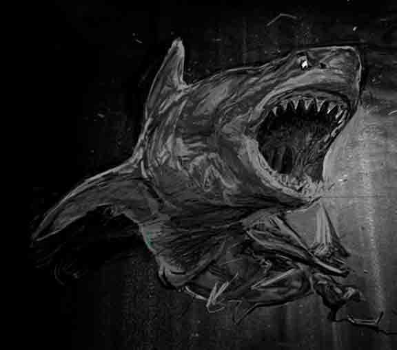
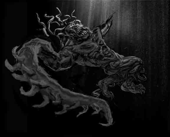
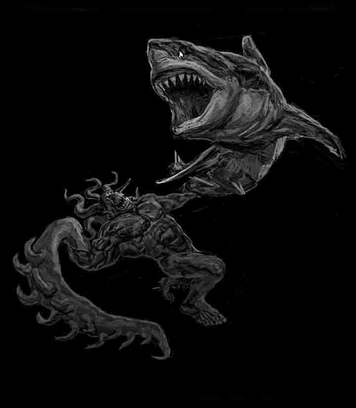
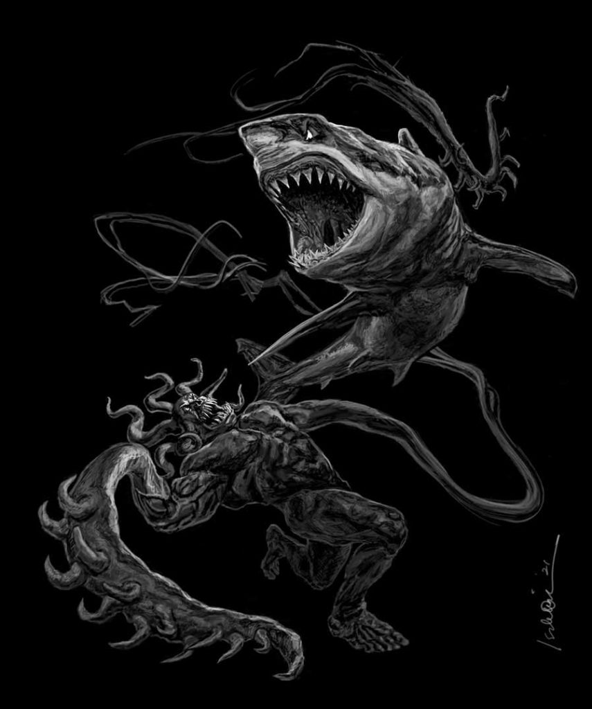
And Finally, I Present the Final, Final, Final Version of Malignancy’s Shark vs. Promo Dude
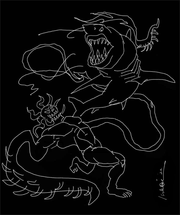
Just kidding. If you’ve survived this long, here is the actual [ LINK ].