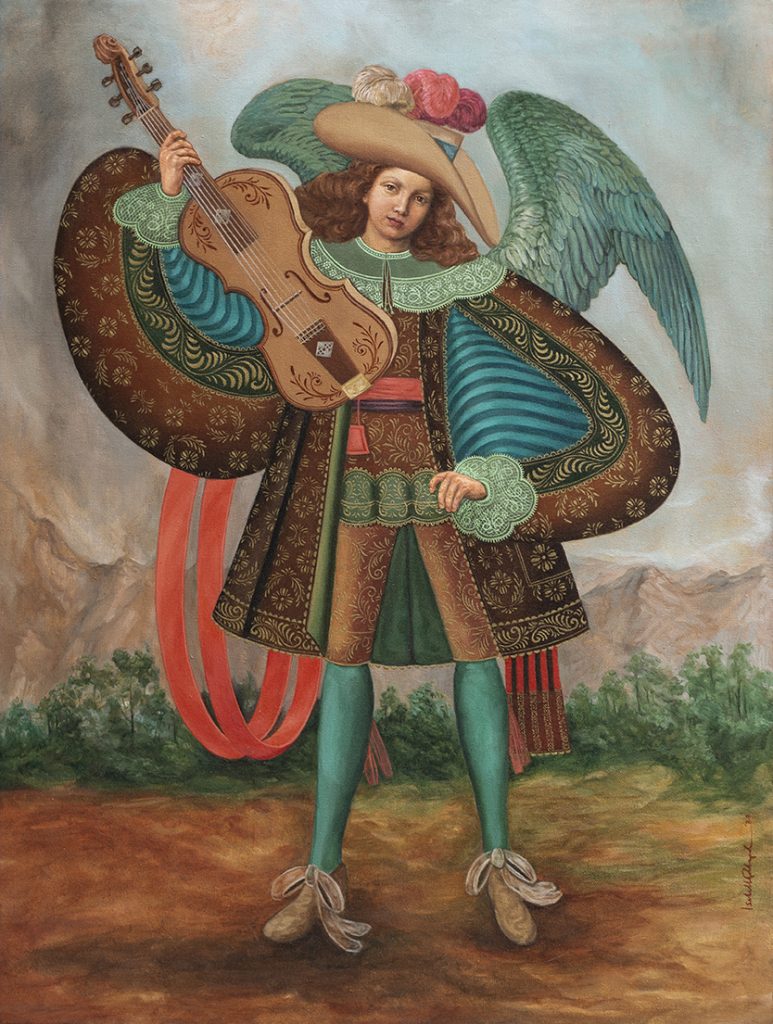
Oil on canvas
42″ x 32″
2020
This painting is the reigning champion of my most unusual commissions. Whilst the objective was to create a “replica” of another painting, I was also free to improve it as I saw fit. There is truth in saying that all pieces of art, even copies are “original works of art”. However, this painting was free to grow an ‘’original’’ identity of its own.
Prior to this project, I had no idea what on earth a “Cuzco” painting was. This style, also known as “Cusco”, “Esquela Cuzquena”, or “Cuzqueno”, originated during the Spanish colonization of the Inca Capital Cuzco, Peru in the 16thcentury. All these religious paintings are influenced by Mannerism, a style that was prevalent in Europe during that time. It explains the unusual proportions of the figures, with long limbs, tiny extremities, and faces. You may read more about it HERE.
These paintings are great examples of cultural assimilation, e.g. how the traditional dove like wings of “Western” angels are substituted for the wings of a more colorful and tropical kind. We see another example of assimilation in how the Philippines’ malevolent mythological creatures are deterred by holy water. Nevertheless, one can safely say that the Cuzco movement had a more creative outcome.
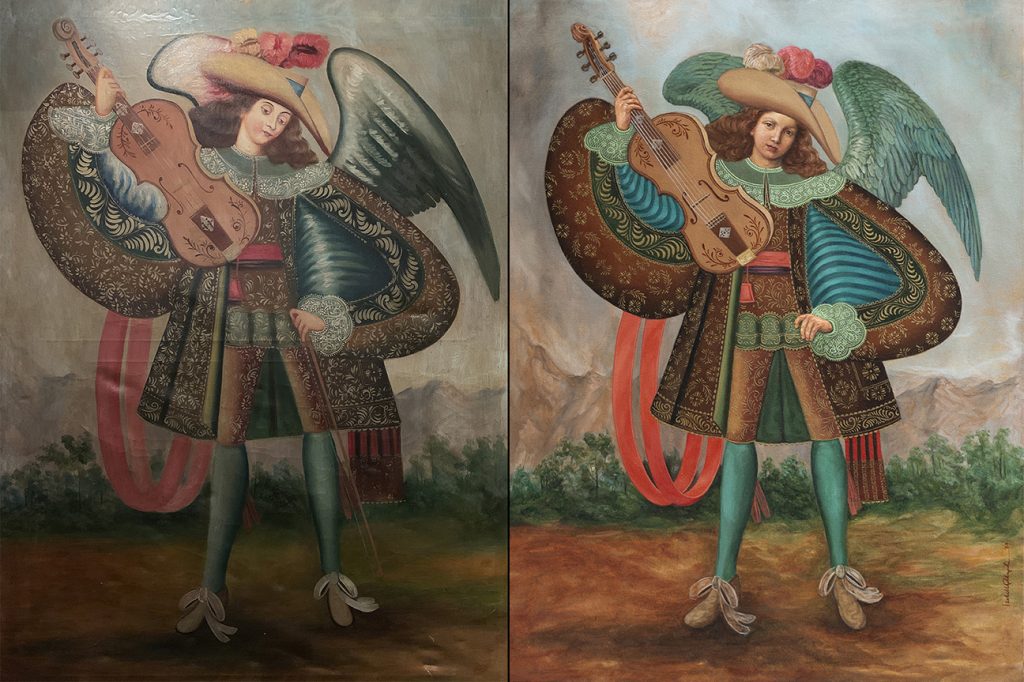
The original painting I had to “copy” is currently hanging in a San Francisco restaurant. The commissioner, a classical guitarist, was drawn to the piece because of the mystery behind the string instrument the angel is holding. Six tuning pegs? Four strings? Very traditional folk inlays + a mother of pearl inlay on the bridge? Is he holding a bow? Just like the mysterious identity of the artist who painted it, whether these were moments of creative confusion, or deliberate tongue-in-cheek gestures to bewilder the viewer will never be truly known.
Let’s get to the modifications:
I. The original was quite faded and cracked, so I had to approximate what the colors might have looked like when it was new + arguably a little extra.
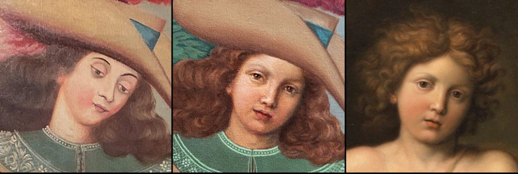
While I definitely wanted to improve the realism on certain areas such as the face and hands, this had to be done tactfully so that they wouldn’t deviate too much from the more 2-d looking clothes.
Being a religious painting after all, it felt appropriate to choose another religious painting for my face reference. Eventually I chose French master Pierre Mignard’s painting of a young St. John the Baptist as a guide. If the original were on the left side of the spectrum and the Mignard reference were at the right, I tried imagining how my version would look if it fell somewhere in between.
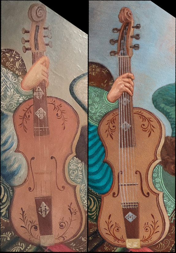
II. The “string instrument” is arguably the most important element of the painting. It had its fair share of adjustments e.g. putting my foot down on how each tuning peg should have a corresponding string. More detail was added on how each string is wound around each tuning peg at the top, and the bridge at the bottom. Apart from fine tuning of the geometry and symmetry, I’ll let the viewer decide what instrument it’s supposed to be.
III. Whilst almost all Cuzco angels have very stylized illustration-like wings, this is one aspect of the original painting that fell short. My version retains the Manneristic proportions but with added realism and brighter colors.
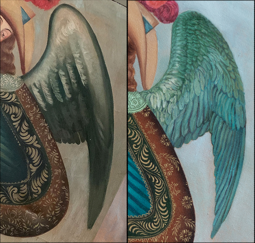
IV. The plumes on the hat had a similar problem as the wings. Volume and detail were added.

V. One of the most interesting considerations of this commission was how to approach the clothes. A number of shapes were repeatedly used, but the embroidery upon closer inspection was rather random. While this certainly merits its own charm, it did not make sense to just copy it mechanically. The solution was to create an inventory for the common shapes and reorganize them into seamless patterns.
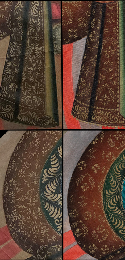
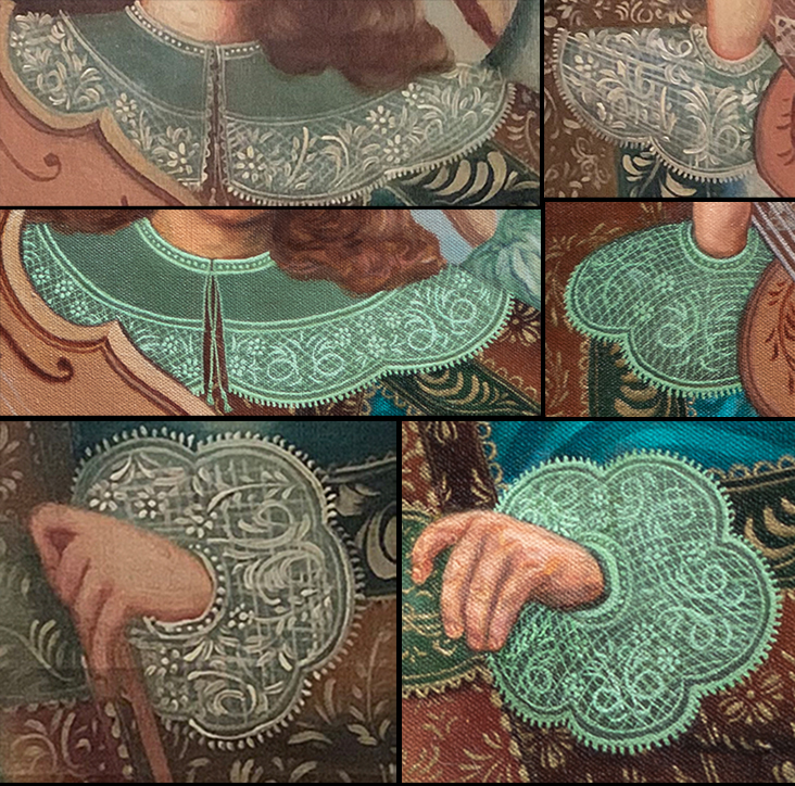
Just like with the coat, I used existing elements to create a seamless and repeating pattern for the cuffs and collar. I also adjusted the cross hatched embroidery to give the fabric more depth—like how one’s clothes curve and conform according to the body.
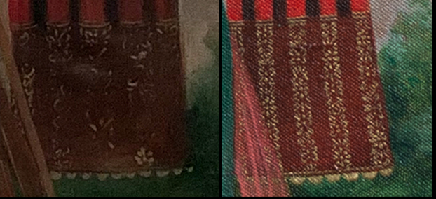
A new pattern was created for the gold stripes on the sash as well.
VI. While I can attribute everything else to stylization and a sense of craftsmanship based on a repeated tradition, I’m not going to deny that what bothered me the most about the original painting was the coat’s hem and how the sash was hanging straight down behind it. Little did I know that it was a clue to yet another surprise.
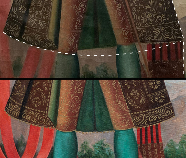
During the additional research to understand the sartorial elements of the angel, I accidently discovered that the San Francisco painting is also an adaptation of an even older piece from the 17th Century. The peculiarities of certain areas were suddenly brought to light, e.g. the coat’s strange hem, and the even stranger waterfall-like right sleeve, amongst other things.
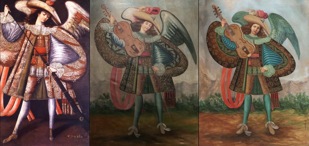
How my painting turned out to be a “2nd generation interpretation” is extremely unusual, and amusing. And I can’t help but relate this coincidence to the premise behind one of my favorite books, Heart of Darkness. Whilst the book is a story of a story of a story, this is a painting of a painting of a painting.
**For the record, the angel is wearing something similar to a European rifleman or musketeer’s outfit.
