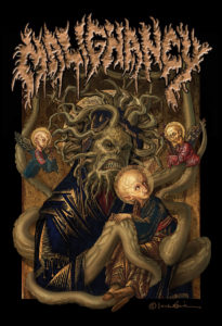
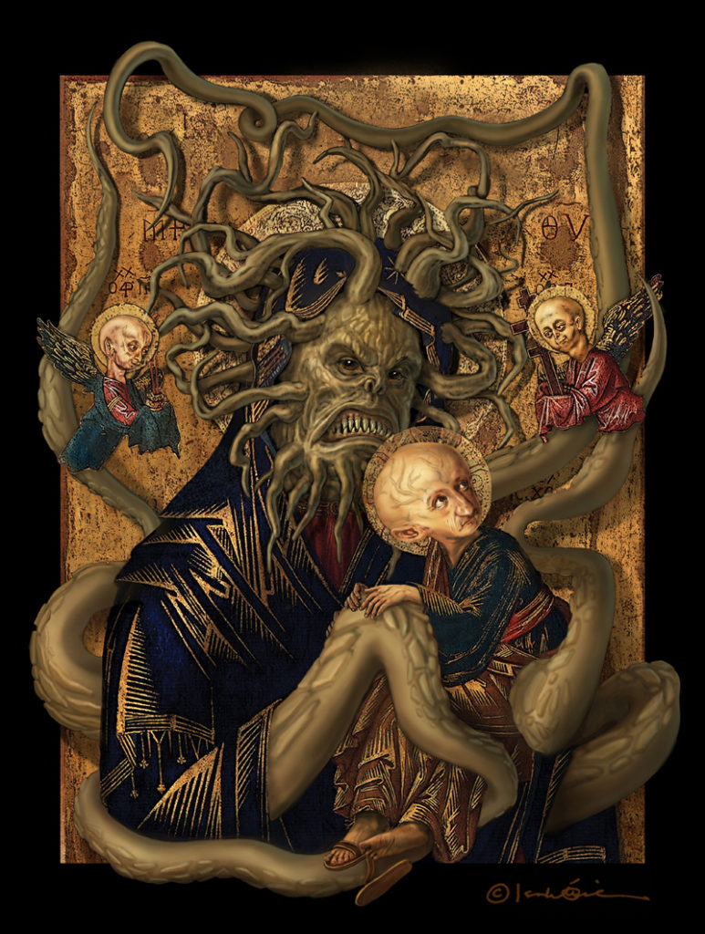
 2013 hasn’t been disappointing in terms of exciting projects that redefine the word ‘job’. This one in particular falls under the ‘surreal’ category in terms of parameters and workflow.
In Dark Purity is perhaps the most respected, and tastefully infamous ‘zine in this side of the world. After making the IDP cover 9 years ago, the opportunity to work with its creator Alex once more was a grand occasion –especially when I saw the words ‘full color’, ‘special edition’, ‘professionally printed’, and ‘Malignancy’.
Even with severe religious reservations, I don’t go out of my way proclaiming my ideology unless solicited –especially if it’s merely to offend people. I really have better things to do. Religion’s intention is inherently good, and the greater problem lies in people’s often ridiculous interpretation of it.
Through the years, I’ve sadly developed a strong aversion towards the word ‘art’. However, if there is one good thing I can point out about religion, it is the historical contribution to Fine Art. Even if those paintings, structures, and sculptures served another purpose, it’s nice to look back at a time where one could say art was actually ‘good’.
Because of my preoccupation with continuity, I suggested that the new cover should be reminiscent of the 2004 one. In ‘Implanting the Mythos’ I turned one of the Philippines’ most “popular” Virgin Mary statues (it used to look like a rusty tin can, and they’ve recently added gold glitter) into one of its most notorious mythological creatures, the ‘manananggal’. This time however, Alex chose the religious icon to manipulate.

Unlike the abominable Lady of EDSA, whose only value would exist were it set on fire and dropped on the senate, Our Lady of Perpetual Help is actually a fine example of the evolution of materials and techniques in painting– mainly, the utilization of metallic surfaces to imply ‘divinity’.
This brings up my earlier point that the problem isn’t religion per se, but rather what people do with it. Again, purpose aside, the metallic painting surface was a brilliant technical innovation –or should I say deviation? This method was actually proliferated by the church in the Dark Ages to delude the masses into thinking that those mysterious glints and rays of light coming off the painting’s surface were actual miracles. Of course, life was a lot simpler back then, and once the word got out, the technique was perpetuated for its aesthetic appeal.
* * *
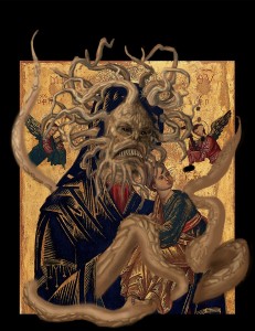
One minor concern was the depiction of Progeria. It is a debilitating and crippling disease whose victims are the last people I would want to offend. I wanted to portray them without prejudice or bias, just as matter-of-factly as the way they play the hand they are dealt.
The initial goal was to create the most realistic version of Malignancy’s promo dude ever conceived. However, I soon realized that a compromise had to be made because of how the original OLPH’s clothes were flatly and geometrically rendered, like a print. The end result is a more graphic drawing style so that the subjects would not look so disparate from their clothing. In the same vein, I altered the garments on the original painting to create a better illusion of depth.
My solution for presenting anything potentially controversial is always to (hopefully) use the quality of my work to make the viewer consider the idea being presented. Besides, just like the rest of us, they probably just don’t want to be reminded that all life is preparation for death.
Here is the artwork in an earlier state. Please click to enlarge.
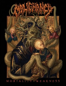
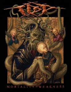
Here are versions of the artwork with the title + Malignancy and In Dark Purity logos respectively. Please click to enlarge.
There were understandable, unforeseen delays to this project that pushed its release date back. I took the opportunity to improve the design and original drawing. Here’s another possible version with the logo from none other than Danny Nelson himself.