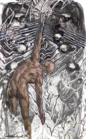
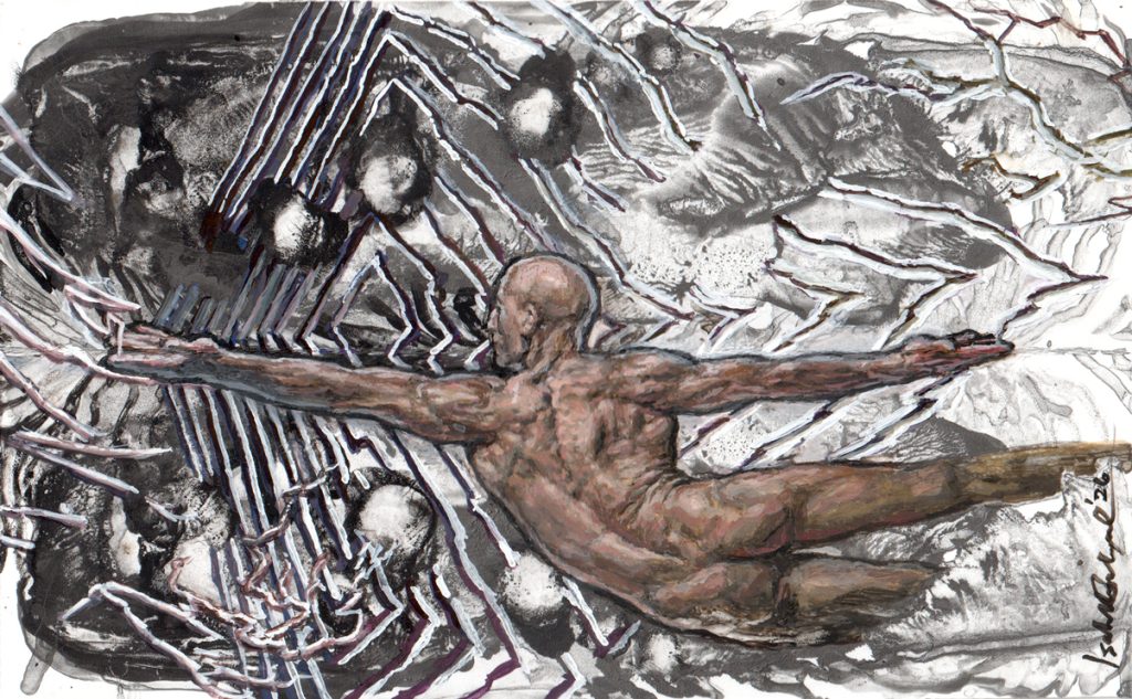
“Dark Matter”
watercolor + gouache on paper
13 x 20.5 cm
2026
This painting is for my “Dark Matter Challenge” to create “The Darkest Painting on Earth”.
The mechanics are on my FB and IG accounts and anyone is welcome to join. I am sharing how I fulfilled the requirements so that people can come up with better ideas.
IIa. What are the darkest “blacks” you can mix using color?
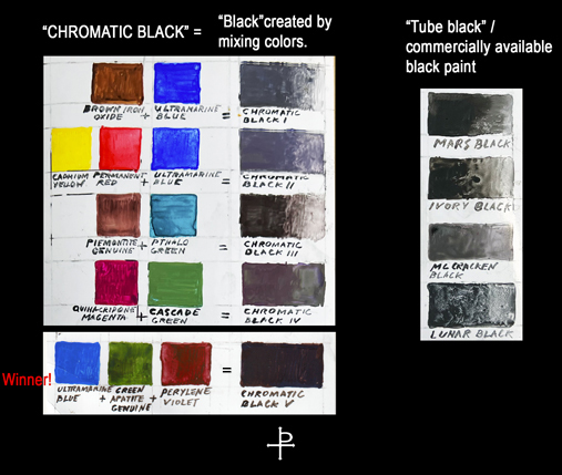
Based on my own chart, I initially used Chromatic Black IV and Chromatic Black III, then discovered a really potent combination using Ultramarine Blue + Green Apatite Genuine + Perylene Violet. Formerly known as “Chromatic Black V”, it is now renamed “Apatite for Destruction” for being so dark.
Similarly, even “straight from the tube” black paint varies, and over the years, I’ve learned to use all kinds of black depending on the occasion.
My work has ranged from combinations of chromatic black, or chromatic black + tube black layered on top. Take note that even if they’re on the same painting, the tube black is always a separate layer and never “mixed” with other colors until now.
In “Dark Matter”, it is my first time to mix tube black with colored pigments via the “Zorn Palette”.
Blacksphemy!
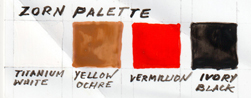
Upon first learning about the “Zorn palette” I was horrified. Tube black is mixed with yellow ochre, vermillion, and white for everything! When I tried it with skin tones, everyone looked undead. Eventually I realized that in order for the Zorn Palette skin tone to look more natural, there needs to be tube black paint in the background too. This definitely takes “paint it black” to a whole new level.
One may notice that in my painting below, “Oortovician”, the “black” areas are “purplish”. This was done intentionally to show the limitations of chromatic black, especially when used along with very bright colors. Also I had not discovered “Apatite for Destruction” back then. Still, outgrowing my “blacksphemous” dogma feels like a new whole new direction to explore.
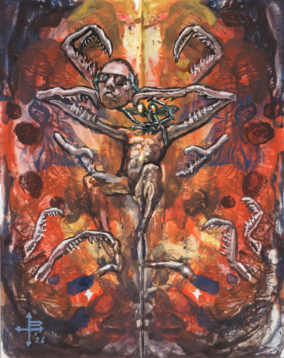
“Oortovician”
Watercolor + Gouache on paper
20.5 x 13 cm
2026
IIc. What makes this painting Darker than Dark, Blacker than Black?
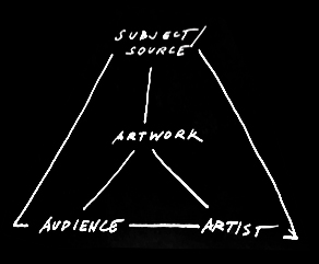
I am using the “6 Classical Relationships” (aka “The Conceptual Framework) in Art Theory to answer this.
1. The Artist as related to his Work:
i. In this painting, I made what scientists call “dark matter” visible. Dark matter is so dark that it is invisible in our dimension, yet its gravitational pull can be detected. Turning something as dark as dark matter into something we can see with our naked eyes feels pseudo-nefarious. Perhaps it’s a new branch of black magic.
ii. By mixing black using color, I also create more “dark matter”.
iii. “Apatite for Destruction” is made out of mixing colored pigments, yet it is even darker than some of the commercially available tube black paint. I can arguably say that I’ve created the darkest “color” I’ve ever seen.
iv. Many different kinds of black are also “blacker than black and darker than dark”. One can count all the blacks that are physically in my painting. They are in our reality, not something subjective or conceptual. For the record, I used all the chromatic blacks in my chart + the newly discovered “Apatite for Destruction” + 2 kinds of commercial black paint.
v. By making a “void” occupy physical space. See Section IV.
v. By using a “Black on Black” concept as its foundation, this painting offsets one of the most well established doctrines in art theory, Kazimir Malevich’s “White on White”.
vi. Through contrast: One can only appreciate the extent of something by seeing it alongside its opposite. Therefore I also used multiple whites. The white of the paper, commercially available white paint (Titanium white is naturally cool), and “warm white” created from adding in a tiny bit of chromatic black, all counterbalances the range of the darkness in this artwork. Also, white created from black is another very dark matter.
vii. Exoneration of what was previously deemed as an “art crime” by using the Zorn Palette and deliberately mixing black into everything, including white.
2. The Artist as related to his Audience:
i. Through showing the audience how to mix chromatic black, they create their own darkness and even more dark matter.
ii. Through making them physically apply chromatic black, I show them how to make something literally positive, because their creations will occupy space in our dimension. They also learn how to transform darkness, making Jungian “shadowwork” a friendlier process.
3. The Artist as related to his Source:
i. Though fascinated by Jung’s work, unlike him, I find the Dark Arts an integral part of a whole.
ii. I’ve always wanted to create something for artists specifically, since the results will inadvertently reach the audience anyway.
iii. By involving them in this activity, I want to show artists how the Formalism process evolves their own originality as they use it. This way their concepts are not left behind by their skills.
4. The Audience as related to the Work:
i. If you look closely, a fold bissects this artwork horizontally because it began as a Rorschach test. Since Rorschach tests are used for classifying and finding darkness, the audience learns how to detect the implicit and invisible kinds by seeing a Rorschach test with the correct answers made visible.
5. The Audience as related to the Source:
i. As the audience learns about the different kinds of darkness, they can choose whether or not it should influence their lives.
ii. Dark matter is like the Jungian shadow. It is something you cannot see yet its gravity can affect your course. By making people create it, detect it and use it, they learn to face it, control it and transform it inside and outside themselves.
iii. By giving the people tools to discern ranges of stimuli vs. simply black or white, they start using their Free Will. Imagine growing up in a world where all food is either “bland” or “salty”. If you tasted something sweet, you would probably classify it “salty” as a generalization. The more options someone has, the less mechanical they become.
6. The Source related to the Work:
Making people understand and face their darkness was Jung’s life’s work. The difference this time around is that just by thinking about my concept, people do this inadvertently. Along with the ones who mix the paint and make the art, everyone also ends up propagating darkness on my behalf.
III. *** I’ll answer this after IV***
IV. Bonus: Other fun stuff about this painting to think about
a + b + c. Is the Lightning light or dark? Positive or negative? What color is it?
In color theory, black pigment is the presence of all color and white pigment is the absence of it. When it comes to light/photons, things are in reverse. White becomes the presence of all color (imagine sunlight making a rainbow), and black, considered space or a void, is the absence of it.
Commercially available black paint “contaminates” or even “destroys” all colors because unlike colored pigments, it undergoes a secondary physical process that alters it at a molecular level, e.g. the burning of animal bones to create the original “ivory black”. Being different molecularly, and having its space altered by a process like burning already makes some commercially available black pigments closer to being a void than one might actually think. It’s safe to assume that just by using black paint straight from the tube, one is already using positive and negative spaces simultaneously.
Tube black pigment aside, such a thing as black lightning is still BOTH light and dark, positive and negative. As depicted in my artwork, “black lightning” does not exist in our reality unless it is painted in 2-D. Similarly, an object’s 2-D shadow in our reality can only occupy 3-D space when it’s in a lower dimension –again like when a shadow is physically painted into an artwork. These are only two examples of how physically negative voids can also be positive.
Objects gain new properties by shifting dimensions. And just like with black lightning, the Universe’s dark matter is only detectable in a lower one –For now.
III. WHY (am I doing this)?
a. Many times I’ve noticed that artists improve in the skill department while leaving the idea department behind. They also have a hard time moving forward once they become good at something. Therefore, I want to demonstrate how without losing their individuality and originality, the Formalism process will allow their ideas to evolve with them. And when the artist evolves, the audience evolves.
b. I also want to demonstrate how a painting can be technical and innovative even before getting into the subject matter. This is one way artists can veer away from emotionally loaded pieces that end up looking like their personal therapy.
c. What is Formalism again?
Anyone who studied the color wheel in school –Tones, values, kinds of lines, light, shadow, and shapes has already had an overview of it.
Although the roots of the ideology can be traced back to the Classical Greek Philosophers, the official origins of the term were likely Russian. I would also like to credit German Philosopher Immanuel Kant for introducing a sense of morality in aesthetics. My definition would be: “The Assessment of Aesthetics without Emotional Attachment”.
c. The Maldacena Conjecture:
The Maldacena Conjecture, proposed by Argentine theoretical physicist Juan Maldacena, suggests that every theory has another one hidden in its lower dimensional “shadow”.
While creating this painting, I had absolutely no idea what the Maldacena Conjecture was. But working with paint made me experience and understand it even before knowing that someone else already identified the phenomenon.
Also, paint has helped me grasp how dark matter in our Universe can behave. I find it valuable that a systematic approach to art can teach us about Universal processes without second hand information. Interestingly, in developing my own ideas in this painting’s 2D “shadows”, I’ve discovered more than just one sub-theory too!
d. The Sub-Theories in this Painting’s Shadows
i. The Black Lightning Theory:
Invisible objects become visible if we shift the dimension they are in. In order to make dark matter visible, we need to make it 2D. In order to turn shadows into matter, we make them 3D. The painting process allows us to perform such “inter-dimensional shifts”.
ii. Triple Negative Space:
While painting all sorts of black, thinking about the spatial properties of black lightning, and using white paint on white paper, I couldn’t help but remember that the paper itself is considered negative space, especially in the Eastern painting tradition. Come to “think” of it, isn’t just thinking about it already creating space? It means that this composition has at least three kinds, or “Negative Space to the Nth Power”. After all these years, Rothko’s double negative space thesis finally has a new development.
iii. On the perception of art as a whole:
Aside from “White on White”, Kazimir Malevich, is most known for “Suprematism”, a movement which insisted that art need not be tethered to any existing reality.
I completely disagree. Yes art can be completely abstract, but it needs to be tethered to our reality so that people can measure its quality. Then even the public can make more educated decisions about whether an artwork is good, merely a duplication exercise, or hot air from someone’s ass.
iv. “The Oortovician Series”
Standing at the edge of everything gives us room to move around and expand.
The “Oort Cloud” is the outermost threshold of our solar system. “Ordovician” is the second geologic era of the Earth’s existence. “Oort” + “Ordovician” = “Oortovician”. An Oortovician is a creature that lives between the edge of our dimension and all others.
Every time I take a Dungeons & Dragons alignment test, I’d get “true neutral”. Not too long ago, it felt like lamest most boring thing ever, like I couldn’t make a stand. But after all these years I’ve realized that true neutral is not such a bad place to be.
Weighed by nothing, not static or stuck to anything, between the past and future, and free to take any course at any given moment, one is constantly at the brink of discovery and sees all possibilities before deciding what to do next. There’s nothing to rebalance on safe ground, and this constant effort to keep from falling off the edge is perpetual momentum for creativity.
V. More ideas to explore for now:
1. Can colors cancel each other out by only being side by side? No layering or blending.
2. “The 360 Degree Painting”: Can you create a composition that looks good in any orientation? The “Dark Matter” painting also looks ok left side up, but quite strange the other way around.
3. How many dimensions of negative space can one possibly create? With the Black Lightning Theory in mind, will negative space even behave the same way in another dimension?
4. How does one create “The Impossible Painting”?