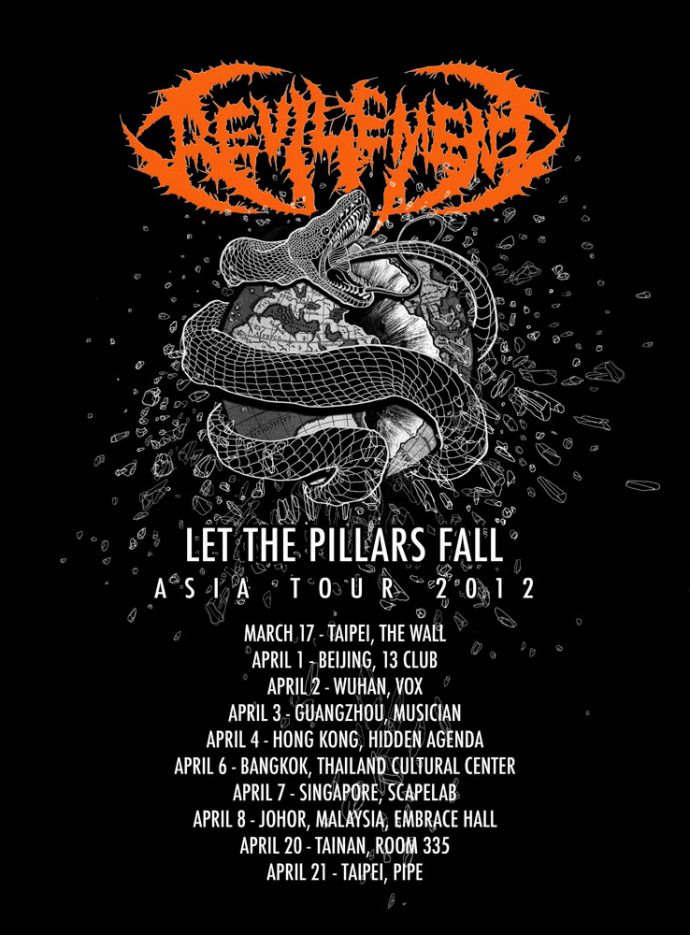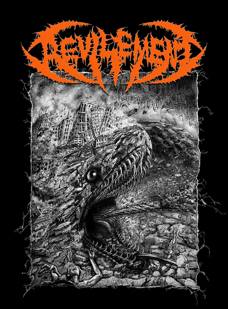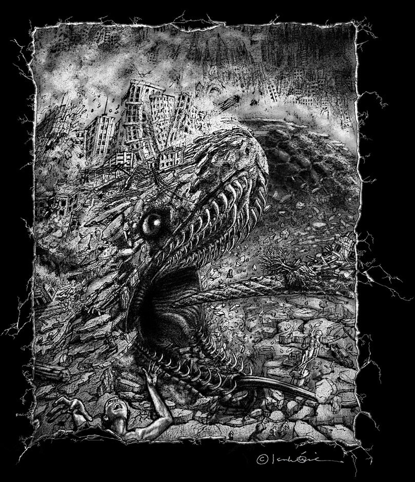
This is a commissioned piece for the Taiwanese death metal band Revilement, whom Brimstone in Fire were fortunate to open for in the Davao, Philippines leg of their South East Asia tour.
Upon the release of their album Pillars of Balance in December 2011, they needed a corresponding design for their tour shirt. Recommended by a mutual friend: local underground events and music promoter, Alvin ‘Insane Bazooka’ Esperanza, I submitted a crude sketch and hoped for the best.
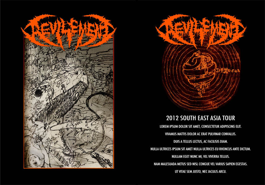
The design was enthusiastically approved, and I was equally psyched about the project.
Instead of searching for ‘apocalypse’ references, I began expanding on their album’s predominant theme: ‘the fall of mankind’ by exploring ways to deconstruct various creation myths. This is when I became reacquainted with the Norse mythical figure Jormungandr, or ‘Midgard Serpent’ who holds the world together by biting his own tail. Interestingly, Jormungandr also falls under an even greater archetype, the Ouroboros –one of my recurring subjects.
Depicting Jormungandr commencing the end of the world by finally letting go of his tail was an epic blueprint to begin with.
Here are stages of the pencil-work:
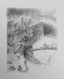
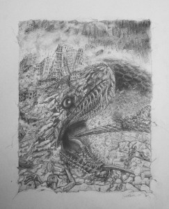
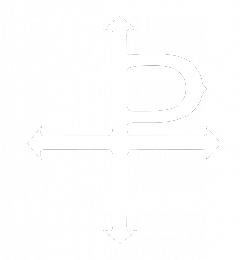
For the initial concept, the imagery for the back of the shirt included a Ptolemaic diagram of the universe –ostensibly referred to as the Geocentric view. There is reason to believe that Ptolemy’s diagram was not an interpretation of planets and their orbits, but rather the Alchemical order of elements. The Ptolemaic Diagram of the Universe is from http://www.eso-garden.com/
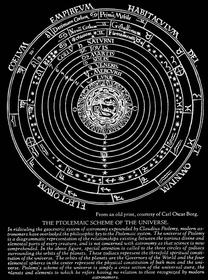
Each planet in the diagram above has a corresponding ‘element’ e.g. Mercury – Quicksilver (mercury), Venus – Copper, Mars – Iron, Earth – Fire etc. Earth is located in the innermost sphere of the diagram. Therefore, Jormungandr’s unraveling would not only destroy the world sphere, but disrupt the concentric outer spheres around it creating utter cosmic chaos.
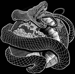
I created this image digitally to represent what is going on in front in full scale. Together with the Ptolemaic diagram, the outcome was not bad at all –In fact, I even ended up with two versions.
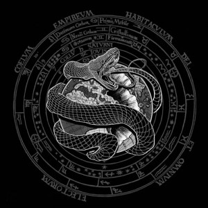
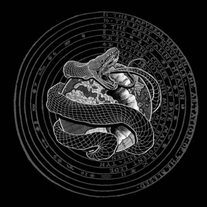
However when I started drawing in the rubble, the design elements started becoming visually cluttered. There was also something about the archaic fonts in the diagrams that visually clashed with the serpent vector.
In my work, I always favor theoretical basis over visual appearance. However, this was one of those rare (practically inconceivable!) occasions where design prevailed over reason.
The end results speak for themselves though.
